The rebranded face of Must
Big news! We have dropped the 'app' from our name and rebranded under a new logo.
As our global community of movie and series fans is growing and our app is getting smarter, stronger and busier, so are our challenges and aspirations. It has been an exhilarating few short months, over which the app has evolved from a simple personal movie list manager to a robust movie social network with an ability to track series and its own breakthrough Must Match movie rating system, among other awesome features.
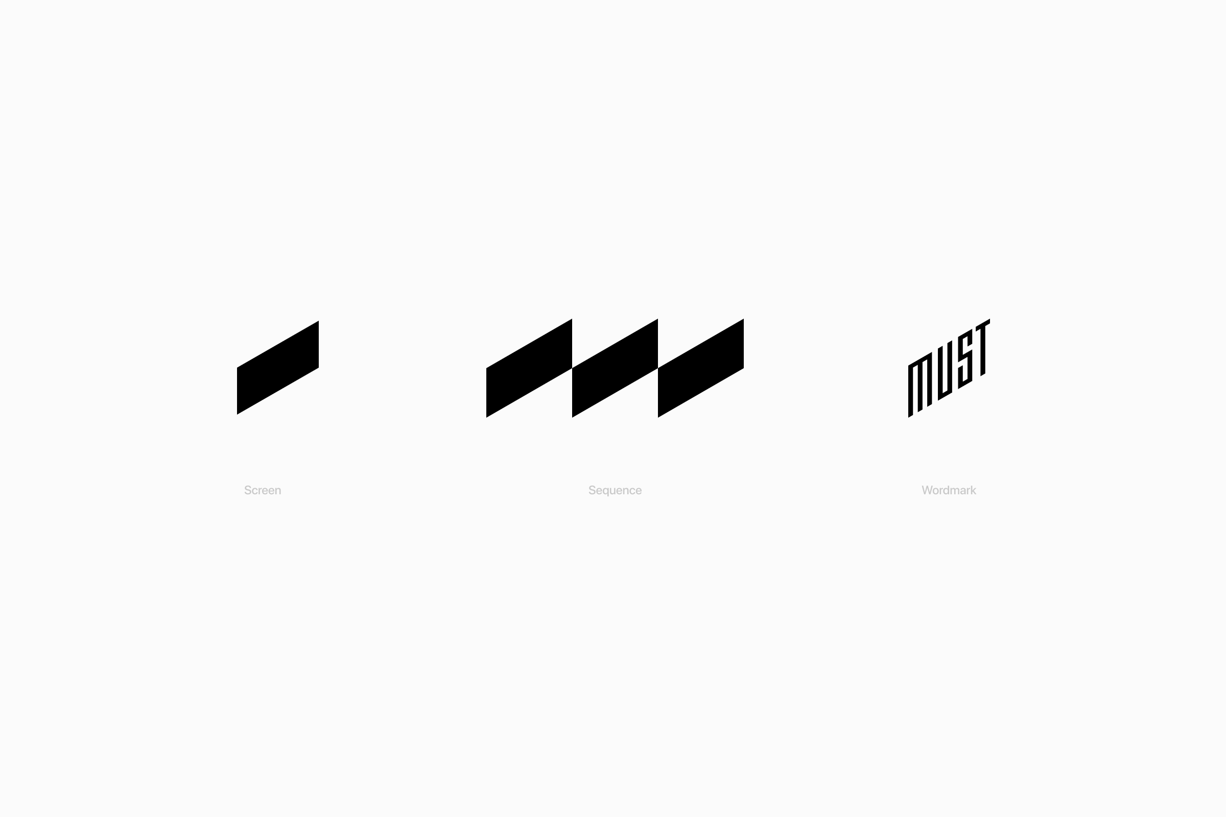
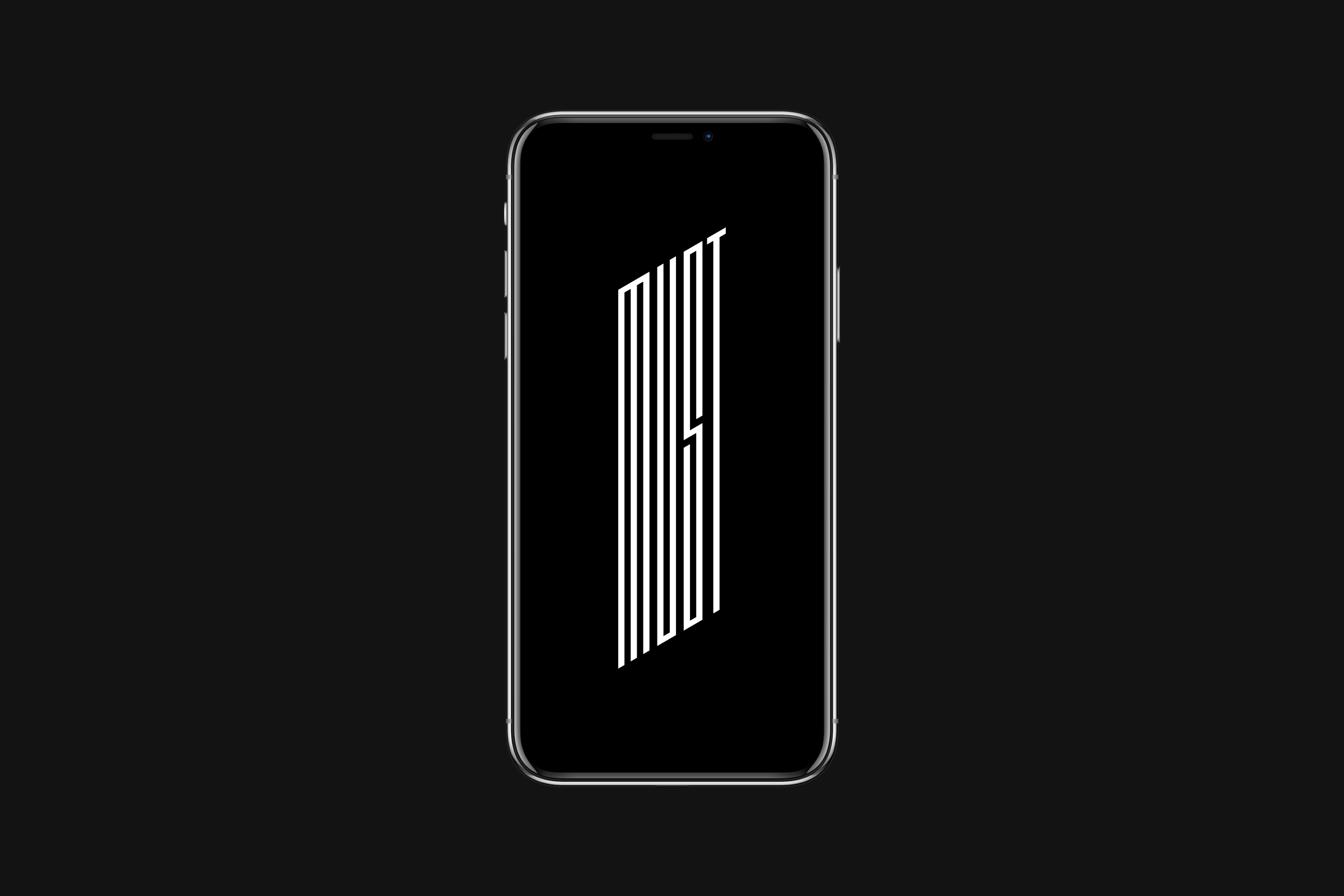
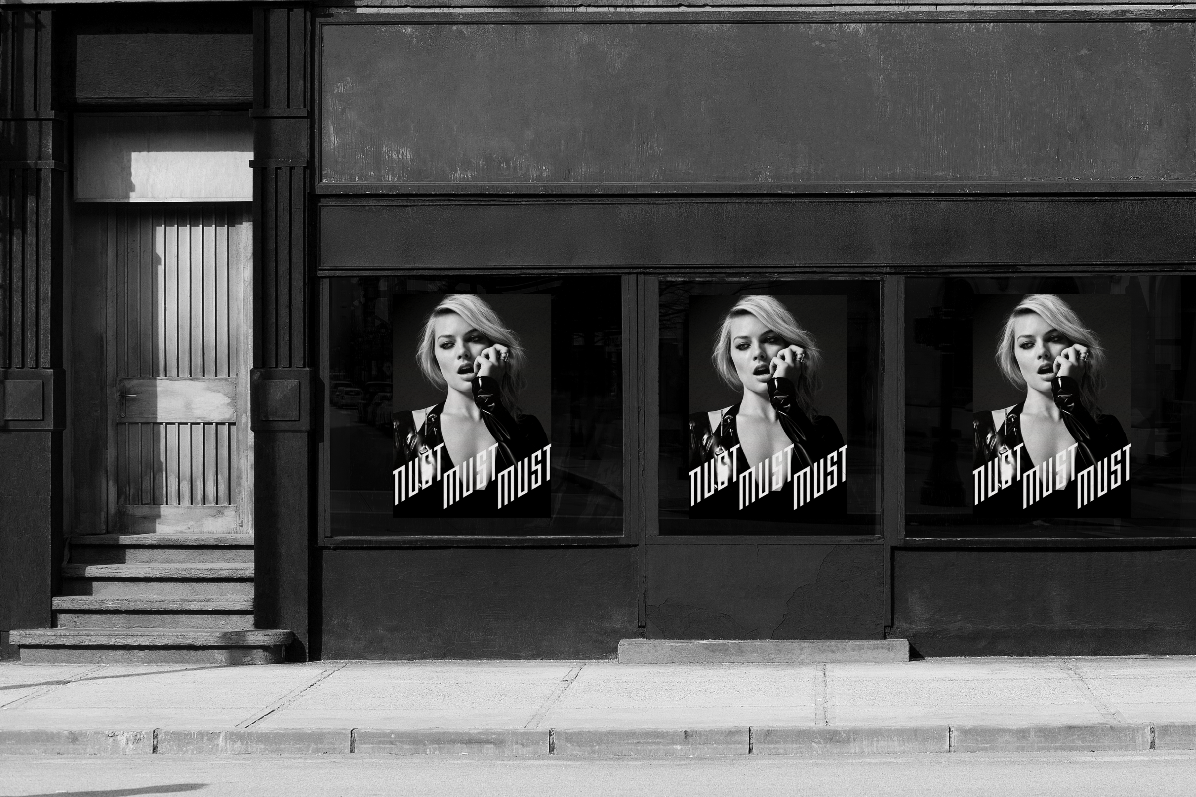
In other words, we’ve evolved and it is time for our logo to follow. We redefined Must to reflect on our grownup ambitions to be the best social entertainment destination for you, be it via app or other platforms. While the road ahead is filled with many fun ideas and features, the philosophy behind the logo is rooted in simplicity. The new graphical element symbolizes a movie theater screen as it reflects on our undying passion for great movie experiences.
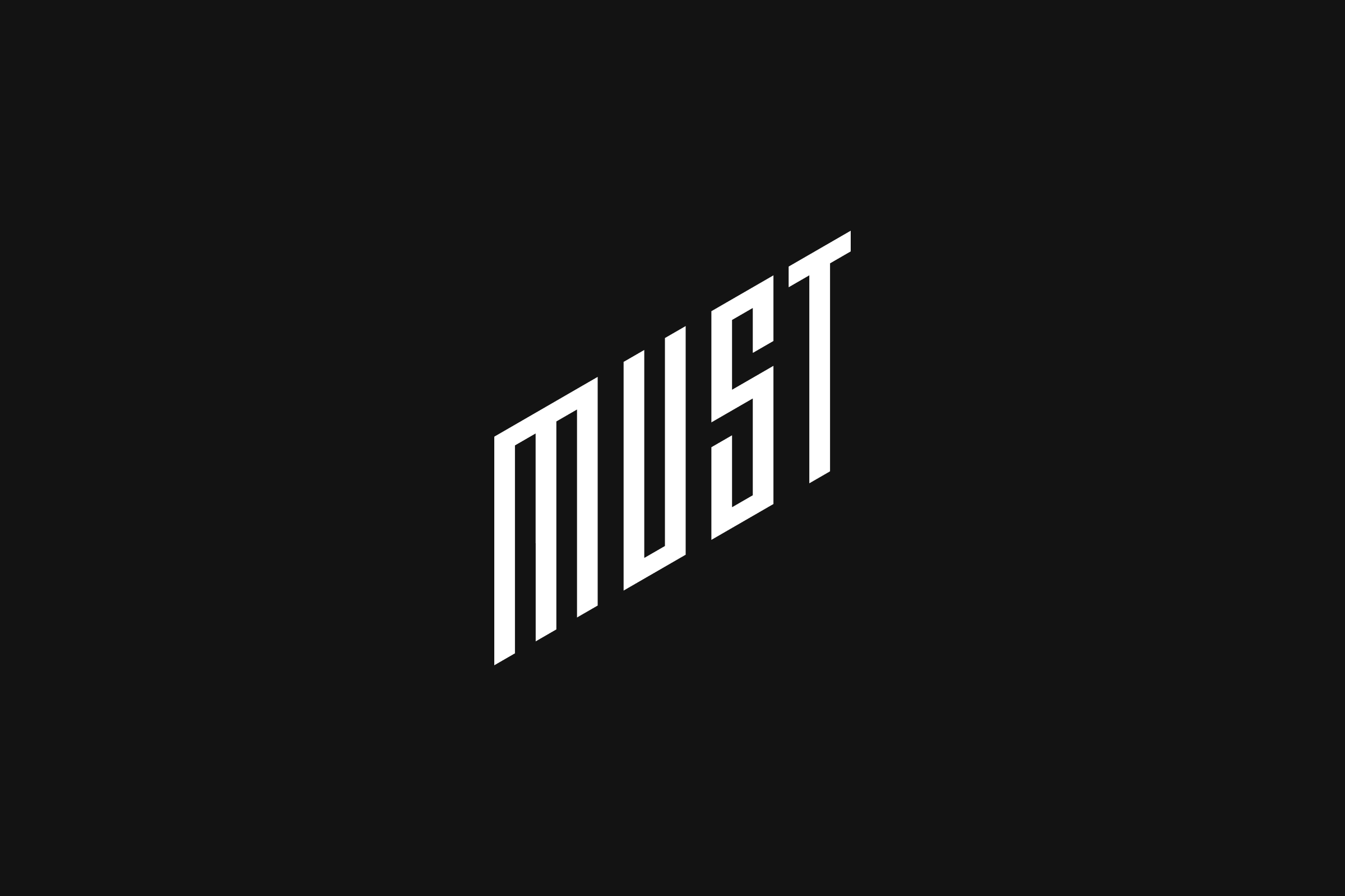
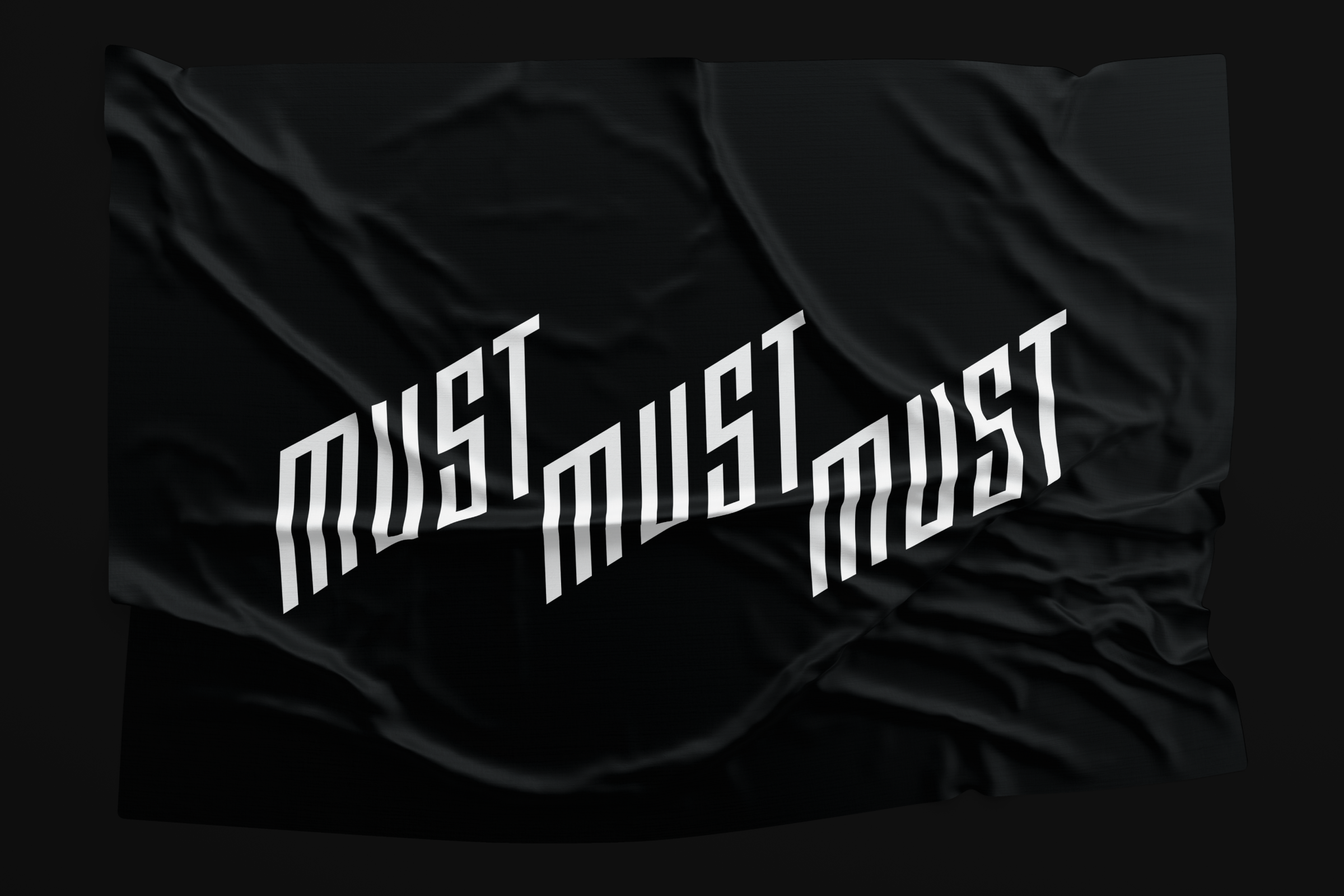
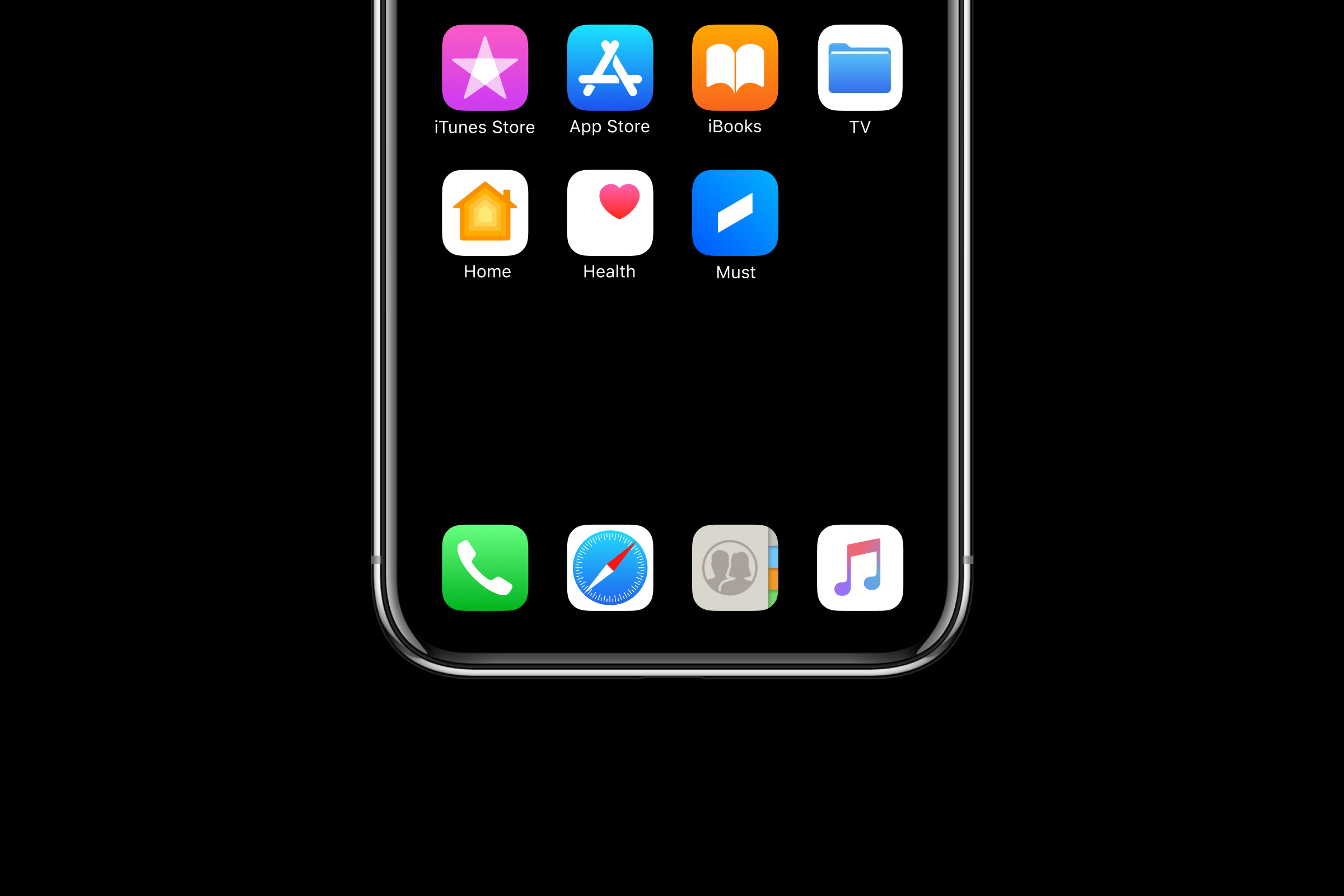
You will note that our new symbol comes in different form factors. We strived for the logo to organically adapt to different environments, which is why graphical elements were designed for each such purpose. On your phones, you will see the icon representing the movie screen. On spaces that are more visible, the word Must will appear instead. Neither of the elements are exclusive to such choosy use, however.
We hope that you enjoy the new rebranded face of Must as much as we do and we hope it becomes a symbolic testament (pun intended) of more great things to come.
Thank you for coming along for the ride!